Visualise Data
Data visualisation is an essential component of understanding and interpreting the vast amounts of data generated by Internet of Things (IoT) devices. In this section, we will introduce the concept of data visualisation in IoT use cases and guide you through practical steps to create visual representations of sensor data. The focus will be on using Grafana, a powerful tool for building dashboards and monitoring systems in real-time.
Why is Data Visualisation Important for IoT?
In IoT environments, devices continuously gather data from various sensors, such as temperature, humidity, or air pressure. Without visualisation, interpreting this raw data would be complex and time-consuming. Data visualisation allows users to monitor and analyse this information effectively, providing clear insights that aid in decision-making, anomaly detection, and performance optimisation. By transforming raw data into charts, graphs, or tables, IoT stakeholders can quickly identify trends, spot irregularities, and respond to potential issues before they escalate.
For IoT use cases, data visualisation is particularly crucial because it offers a real-time view of system performance, making it easier to observe changes in the environment or system behaviour as they happen. This can be vital in scenarios where immediate actions are required, such as in smart buildings, industrial IoT, or environmental monitoring.
Subpages Overview
This section consists of two key subpages that will provide you with step-by-step instructions on setting up and working with Grafana for IoT data visualisation:
Introduction to Grafana
In this subpage, you will be introduced to Grafana as a platform for monitoring, visualising, and analysing data from various sources. You will learn about its key features, including custom dashboards, data source integration, and alerting systems, as well as how Grafana fits into our IoT setup. This section will also explain how Grafana works in combination with InfluxDB and MQTT to visualise sensor data.
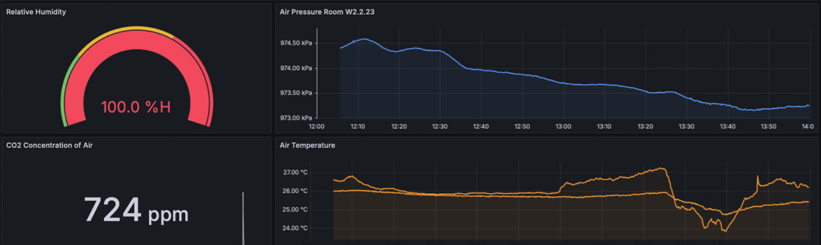
Creation of a Dashboard
This subpage will walk you through the process of creating your first Grafana dashboard, specifically using InfluxDB as a data source. The guide covers everything from logging into the Grafana instance and connecting to InfluxDB to building queries, customising your dashboard, and selecting the appropriate visualisation types. By the end of this tutorial, you will have a fully functional dashboard that displays real-time sensor data, such as temperature or humidity, collected through IoT devices.
Conclusion
Data visualisation is a vital tool for making sense of IoT data. Through the use of platforms like Grafana, you can transform vast datasets into meaningful insights, enhancing your ability to monitor systems, detect anomalies, and optimise performance. As you progress through the following subpages, you will gain a deeper understanding of how to leverage data visualisation for your IoT projects.